


Compose 实现 CollapsableTopBarLayout 以及结合 MotionLayout 使用
by

张可
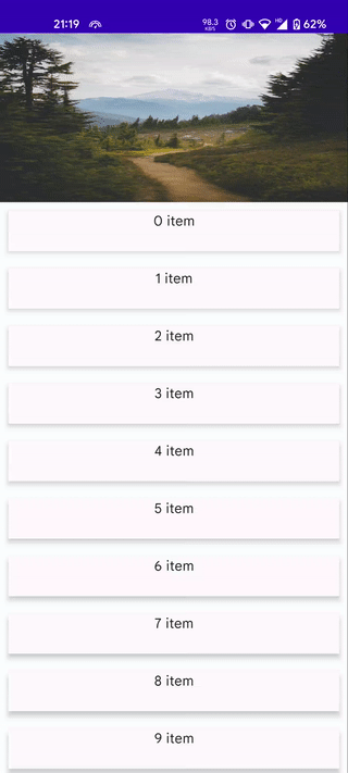
虽然 Android 提供了 CollapsingToolbarLayout,但是 Compose 并没有这个组件,好在 Compose 实现起来并不困难,借助 Compose 嵌套滚动的 Api 可以轻易实现,先看下效果图。
在开始实现之前,需要先了解下 NestedScrollConnection 。
NestedScrollConnection
这是 Compose 嵌套滚动系统提供的 Api,通过它可以参与嵌套滚动事件的处理。
主要包含了以下几个方法:
/**
 * Pre scroll event chain. Called by children to allow parents to consume a portion of a drag
 * event beforehand
 *
 * @param available the delta available to consume for pre scroll
 * @param source the source of the scroll event
 *
 * @see NestedScrollSource
 *
 * @return the amount this connection consumed
 */
fun onPreScroll(available: Offset, source: NestedScrollSource): Offset = Offset.Zero

/**
 * Post scroll event pass. This pass occurs when the dispatching (scrolling) descendant made
 * their consumption and notifies ancestors with what's left for them to consume.
 *
 * @param consumed the amount that was consumed by all nested scroll nodes below the hierarchy
 * @param available the amount of delta available for this connection to consume
 * @param source source of the scroll
 *
 * @see NestedScrollSource
 *
 * @return the amount that was consumed by this connection
 */
fun onPostScroll(
    consumed: Offset,
    available: Offset,
    source: NestedScrollSource
): Offset = Offset.Zero

/**
 * Pre fling event chain. Called by children when they are about to perform fling to
 * allow parents to intercept and consume part of the initial velocity
 *
 * @param available the velocity which is available to pre consume and with which the child
 * is about to fling
 *
 * @return the amount this connection wants to consume and take from the child
 */
suspend fun onPreFling(available: Velocity): Velocity = Velocity.Zero

/**
 * Post fling event chain. Called by the child when it is finished flinging (and sending
 * [onPreScroll] & [onPostScroll] events)
 *
 * @param consumed the amount of velocity consumed by the child
 * @param available the amount of velocity left for a parent to fling after the child (if
 * desired)
 * @return the amount of velocity consumed by the fling operation in this connection
 */
suspend fun onPostFling(consumed: Velocity, available: Velocity): Velocity {
    return Velocity.Zero
}
上面是直接 copy 的代码,注释啥的都写的很清楚了。总的来说就是当你给一个 Modifier 设置了 NestedScrollConnection 之后,这个节点就会参与到嵌套滚动的分发流程中去,并且会回调上面的几个方法来交给你控制。
- 入参 available 表示此次可滚动的增量值,包含 x 和 y 轴的值,可通过正负判断垂直方向。
- source 表示是用户拖动还是惯性滚动。
- onPreXxx 方法表示滚动之前,onPostXxx 方法表示滚动之后。
- 函数返回值表示此次需要消费的值,不消费则返回 Offset.Zero,否则返回消费的数值,剩余未消费的值将会继续交给正在滚动的节点处理。
需求分析
具体到我们这个需求,只需要关注 onPreScroll 方法即可。
观察上面的需求,页面由两部分组成,上面可折叠的头部分以及下面的可滚动部分。可折叠头默认展开。
向上滚动时先折叠头部,折叠到最小值时停止折叠,下面开始滚动。
向下滚动时先滚动下面的内容部分,直到滚动完成,变为不可滚动状态时再开始展开头部。
此外,对于使用方来说,可折叠部分未必是单纯的控制高度,也可能包含其他需求,例如根据折叠比例控制颜色,或者移动某些节点位置等,那么我们需要将折叠比例值暴露到使用方。
接口设计
首先会有一个名为 CollapsableTopBarLayout 的 composable 函数。
除了 modifier 之外,该函数至少还应该包含两个 composable 函数作为入参。
topBar: *@Composable* (collapsableProgress: Float) -> Unit: 顶部可折叠区域scrollableContent: *@Composable* () -> Unit: 底部可滚动区域
还需要一个表示可折叠区域最小高度的入参,可滚动区域是否可以向前滚动也是需要作为入参传入的。
minTopBarHeight: DpcontentCanScrollBackward: State<Boolean>
本着实用性考虑,可滚动区域的最大值就不作为入参传入了,我们将首次 measure 出来的高度作为最大高度。
那么这个函数应该长这样。
@Composable
fun CollapsableTopBarLayout(
    modifier: Modifier = Modifier,
    minTopBarHeight: Dp,
    contentCanScrollBackward: State<Boolean>,
    topBar: @Composable (collapsableProgress: Float) -> Unit,
    scrollableContent: @Composable () -> Unit,
)
具体实现
我们核心逻辑主要是在 onPreScroll 方法内,在发生滚动前我们需要判断此次滑动是应该折叠头部,还是滚动底部。
override fun onPreScroll(available: Offset, source: NestedScrollSource): Offset {
    val height = topBarHeight

    if (height == minPx) {
        if (available.y > 0F) {
            return if (contentCanScrollBackward.value) {
                Offset.Zero
            } else {
                topBarHeight += available.y
                Offset(0F, available.y)
            }
        }
    }

    if (height + available.y > maxPx) {
        topBarHeight = maxPx
        return Offset(0f, maxPx - height)
    }

    if (height + available.y < minPx) {
        topBarHeight = minPx
        return Offset(0f, minPx - height)
    }

    topBarHeight += available.y

    return Offset(0f, available.y)
}
上面的逻辑也比较简单,首先判断当前的头部是否是已经折叠状态,这里是通过当前头部高度和最小高度对比得到的,然后接着判断如果是向下滑动且地步滚动区域可以向前滑动就不消费,否则表示地步已经滑到顶了,则开始展开顶部区域。
下半部分的逻辑就是判断如果高度可以继续展开就继续展开,并且消费展开的部分。
上面说的消费都是通过设置 topBarHeight 来完成的,在更新 topBarHeight 时同步更新 progress 的 值。
private vartopBarHeight: Float = maxPx
	set(value) {
					field= value
	        progress = 1 - (topBarHeight - minPx) / (maxPx - minPx)
	    }

var progress: Float by mutableStateOf(0F)
    private set
progress 作为一个 state 会暴露出去。
这部分代码都在 CollapsableTopBarLayoutConnection 中。
class CollapsableTopBarLayoutConnection(
    private val contentCanScrollBackward: State<Boolean>,
    private val maxPx: Float,
    private val minPx: Float,
) : NestedScrollConnection {

    private var topBarHeight: Float = maxPx
        set(value) {
            field = value
            progress = 1 - (topBarHeight - minPx) / (maxPx - minPx)
        }

    var progress: Float by mutableStateOf(0F)
        private set

    override fun onPreScroll(available: Offset, source: NestedScrollSource): Offset {
        val height = topBarHeight

        if (height == minPx) {
            if (available.y > 0F) {
                return if (contentCanScrollBackward.value) {
                    Offset.Zero
                } else {
                    topBarHeight += available.y
                    Offset(0F, available.y)
                }
            }
        }

        if (height + available.y > maxPx) {
            topBarHeight = maxPx
            return Offset(0f, maxPx - height)
        }

        if (height + available.y < minPx) {
            topBarHeight = minPx
            return Offset(0f, minPx - height)
        }

        topBarHeight += available.y

        return Offset(0f, available.y)
    }
}
以及对应的 remember 函数
@Composable
fun rememberCollapsableTopBarLayoutConnection(
    contentCanScrollBackward: State<Boolean>,
    maxPx: Float,
    minPx: Float,
): CollapsableTopBarLayoutConnection {
    return remember(contentCanScrollBackward, maxPx, minPx) {
        CollapsableTopBarLayoutConnection(contentCanScrollBackward, maxPx, minPx)
    }
}
然后就是 CollapsableTopBarLayout 部分,这部分代码比较简单,没啥好说的,直接看全部的代码吧。
@Composable
fun CollapsableTopBarLayout(
    modifier: Modifier = Modifier,
    minTopBarHeight: Dp,
    contentCanScrollBackward: State<Boolean>,
    topBar: @Composable (collapsableProgress: Float) -> Unit,
    scrollableContent: @Composable () -> Unit,
) {
    val density = LocalDensity.current
    val minTopBarHeightPx = with(density) { minTopBarHeight.toPx() }
    var maxTopBarHeightPx: Float? by remember {
        mutableStateOf(null)
    }
    var progress: Float by remember {
        mutableStateOf(0F)
    }

    val finalModifier = if (maxTopBarHeightPx == null) {
        Modifier.then(modifier)
    } else {
        val connection = rememberCollapsableTopBarLayoutConnection(
            contentCanScrollBackward = contentCanScrollBackward,
            maxPx = maxTopBarHeightPx!!,
            minPx = minTopBarHeightPx,
        )
        progress = connection.progress
        Modifier
            .then(modifier)
            .nestedScroll(connection)
    }

    Column(modifier = finalModifier) {
        Box(
            modifier = Modifier.onGloballyPositioned {
                if (maxTopBarHeightPx == null) {
                    maxTopBarHeightPx = it.size.height.toFloat()
                }
            }
        ) {
            topBar(progress)
        }
        Box(
            modifier = Modifier.scrollable(rememberScrollState(), Orientation.Vertical)
        ) {
            scrollableContent()
        }
    }
}
我给上下两个区域都包了一个 Box,上面是因为需要计算高度,下面区域是因为需要设置 scrollable ,否则会出现一些奇怪的小问题。
顺便说下,如果结合 MotionLayout 使用的话,可以实现很多炫酷的交互,例如这种。
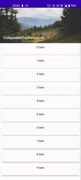
MotionLayout 是 ConstrainLayout 提供的控件,用于实现交互动画,具体使用这里就不多介绍了,跟 ConstrainLayout 比较类似。这就直接放上上面这种布局动画的代码。
@OptIn(ExperimentalMotionApi::class)
@Composable
fun CollapsableTopBarPage() {
    val listState = rememberLazyListState()
    val contentCanScrollBackward: State<Boolean> = remember {
        derivedStateOf {
            !(listState.firstVisibleItemIndex == 0 && listState.firstVisibleItemScrollOffset == 0)
        }
    }
    val toolbarHeight = 64.dp
    val bannerHeight = 180.dp

    val motionScene = MotionScene {
        val backIcon = createRefFor("backIcon")
        val toolbarPlaceholder = createRefFor("toolbarPlaceholder")
        val banner = createRefFor("banner")
        val toolbarTitle = createRefFor("toolbarTitle")
        val start1 = constraintSet {
            constrain(backIcon) {
                start.linkTo(parent.start)
                top.linkTo(parent.top)
                customColor("color", Color(0xffffffff))
            }
            constrain(toolbarPlaceholder) {
                start.linkTo(parent.start)
                top.linkTo(parent.top)
                alpha = 0F
            }
            constrain(banner) {
                width = Dimension.fillToConstraints
                height = Dimension.value(bannerHeight)
                start.linkTo(parent.start)
                top.linkTo(parent.top)
            }
            constrain(toolbarTitle) {
                start.linkTo(parent.start, 16.dp)
                bottom.linkTo(parent.bottom, 16.dp)
                customColor("color", Color(0xffffffff))
            }
        }
        val end1 = constraintSet {
            constrain(backIcon) {
                start.linkTo(parent.start)
                top.linkTo(parent.top)
                customColor("color", Color(0xFF000000))
            }
            constrain(toolbarPlaceholder) {
                start.linkTo(parent.start)
                top.linkTo(parent.top)
                alpha = 1F
            }
            constrain(banner) {
                width = Dimension.fillToConstraints
                height = Dimension.value(bannerHeight)
                start.linkTo(parent.start)
                top.linkTo(parent.top, toolbarHeight - bannerHeight)
            }
            constrain(toolbarTitle) {
                start.linkTo(backIcon.end, 16.dp)
                top.linkTo(toolbarPlaceholder.top)
                bottom.linkTo(toolbarPlaceholder.bottom)
                customColor("color", Color(0xFF000000))
            }
        }
        transition("default", start1, end1) {}
    }

    CollapsableTopBarLayout(
        minTopBarHeight = 48.dp,
        contentCanScrollBackward = contentCanScrollBackward,
        topBar = { collapsableProgress ->
            MotionLayout(
                modifier = Modifier.fillMaxWidth(),
                motionScene = motionScene,
                progress = collapsableProgress,
            ) {
                Image(
                    modifier = Modifier
                        .layoutId("banner")
                        .fillMaxWidth(),
                    painter = painterResource(id = R.drawable.banner),
                    contentScale = ContentScale.FillBounds,
                    contentDescription = "Thumbnail",
                )
                Surface(
                    modifier = Modifier
                        .fillMaxWidth()
                        .height(toolbarHeight)
                        .background(Color.White)
                        .layoutId("toolbarPlaceholder"),
                    shadowElevation = 2.dp,
                ) {}
                val backIconProperties = motionProperties(id = "backIcon")
                Box(
                    modifier = Modifier
                        .height(toolbarHeight)
                        .padding(start = 4.dp)
                        .layoutId("backIcon"),
                    contentAlignment = Alignment.Center,
                ) {
                    IconButton(onClick = {}) {
                        Icon(
                            modifier = Modifier.size(24.dp),
                            painter = rememberVectorPainter(Icons.Default.ArrowBack),
                            contentDescription = "back",
                            tint = backIconProperties.value.color("color"),
                        )
                    }
                }
                val toolbarTitleProperties = motionProperties(id = "toolbarTitle")
                val fontColor = toolbarTitleProperties.value.color("color")
                Box(
                    modifier = Modifier
                        .layoutId("toolbarTitle")
                ) {
                    Text(
                        text = "CollapsableTopBarLayout",
                        color = fontColor,
                        fontWeight = FontWeight.Bold,
                        fontSize = 18.sp,
                    )
                }
            }
        },
    ) {
        LazyColumn(state = listState) {
            items(60) {
                Surface(
                    modifier = Modifier
                        .padding(vertical = 10.dp, horizontal = 10.dp)
                        .fillMaxWidth()
                        .height(48.dp),
                    shadowElevation = 4.dp,
                ) {
                    Text(
                        modifier = Modifier.fillMaxSize(),
                        textAlign = TextAlign.Center,
                        text = "$it item",
                    )
                }
            }
        }
    }
}
代码量略微有点多,但不复杂,都是布局相关的。 MotionScene 是新版本提供 DSL,用来创建约束布局信息,其中包含动画开始前的布局以及结束后的布局,然后通过不同的 progress 驱动 UI 变化。也可以通过 KeyFrame 设置关键帧。
然后在下面的 MotionLayout 中使用 layoutId 与上面的绑定即可。